It's mainly for storyboarding but I've been inspired, like everyone else ever, to try my hand at that sweet-but-intimidating chalkboard art trend that's been happening for a while now.
First, it started like this
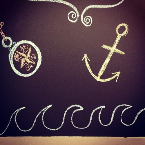
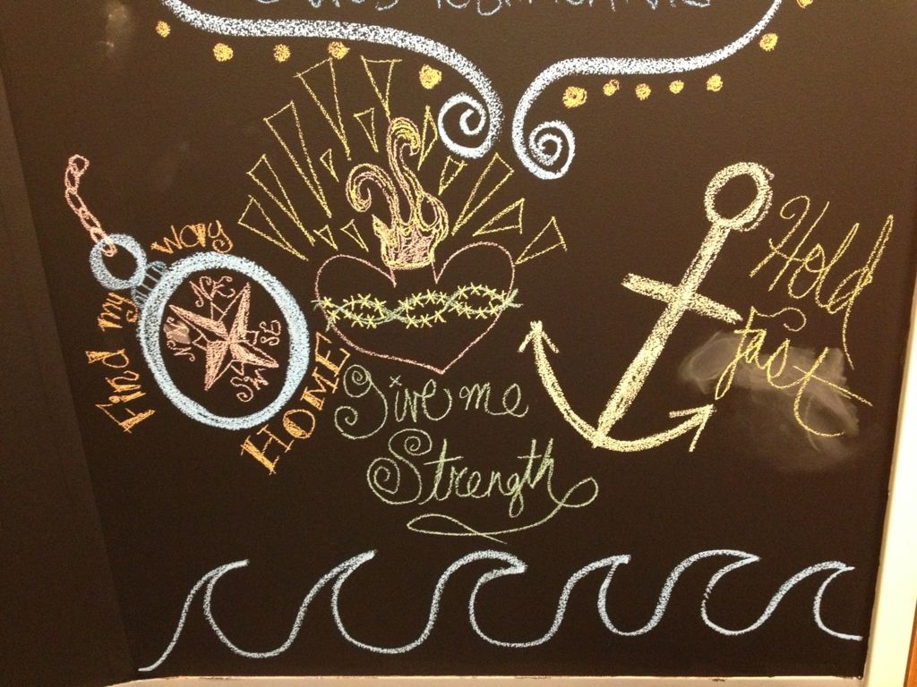
Simple enough, right? Basic and not really too intimidating in the art department. Then, I decided I'd move from the nautical theme that was forming and turn it into a sort of tattoo flash thing.
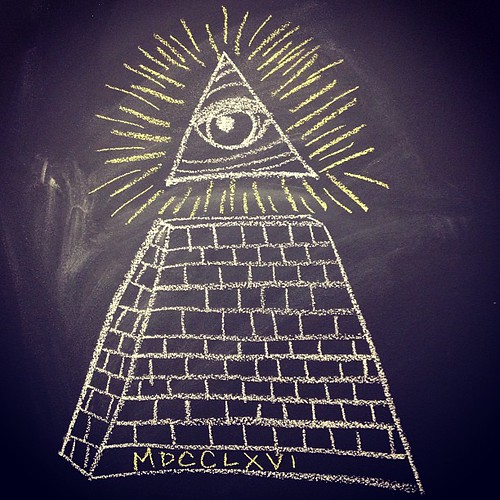
I tried my best to add some kind of text but my lettering was just NOT happening. Then yesterday, I saw this post at A Pair and a Spare - AFTER I had started my "Always Watching" eye (you know, from the back of a dollar bill)
And it got me thinking...what if i just tweaked it a little and added elements from various things I've seen - like the, yes, bathroom wall at Cameli's? So what?! They have a chalkboard wall in there and they have sweet lettering in the way that I want to do lettering (but I always forget my phone to take a photo...). And there are other things I see on my Tumblr dashboard that get my creative juices pumping.
So - I took my inspiration a little further with the dollar and added the ribbon underneath it to my chalkboard.
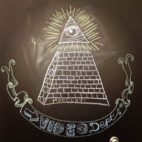
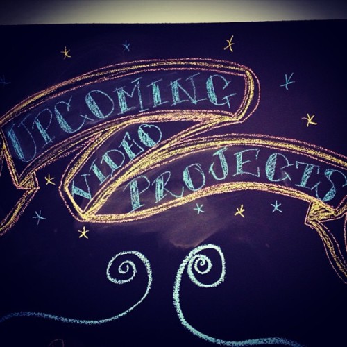
The lettering came from various sources but mostly this beautiful feature on For the Love of Type and The Loop. Love it! I especially love the "Meet our baristas" section! So great! That partially inspired the lettering inside the word "Video" in my ribbon but the size kept it from being larger. The skewed / alternating 3D extrusion is something I have been seeing on Tumblr for awhile now and I really liked it so I wanted to try it. Not bad! The cursive was because I didn't have enough room to add 3D extruded text for the "Dept." part of it. Oh well. I'm thinking in my quiet moment before the chaos starts today, I'll do some scripting above it in the style of the coolest chalkboard artist EVER: Dana Tanamachi.
Her work is MIND-BLOWINGLY AWESOME!! Check out her time-lapse videos to see how the magic happens! I was in complete awe! Her work is incredible and I'm hoping to take a page from her book and make something beautiful. It makes me want to dedicate a chalkboard wall at home so I can experiment with her style. So beautiful!!
And you know, this kind of experimentation with typography and illustration has reawakened my creative spirit. It's making me look at things a little differently now. I know animation and typography are not exactly the same but experimenting with different styles and actually taking the time to draw something out myself is changing my perspective on motion graphics. It makes me think about the process a little more and it's helping me be able to fine-tune my key framing for more precise movements. I never thought those two things would go hand-in-hand but it's a nice change! Also - if I'm having an animation brain freeze, I'll take that time to sketch on the wall and come up with some ideas. Definitely an office upgrade!
No comments:
Post a Comment